When you're building a hockey squad, choosing the right logo is as crucial as having a solid game plan. A killer logo isn’t just a badge—it’s the heart and soul of your crew, fueling pride and amping up the team spirit. In this ultimate guide, we're diving deep into the world of hockey logos. We’ll break down the different styles, from classic and vintage designs that scream old-school hockey to sleek, modern logos that bring a fresh edge to the ice. We’ll also explore minimalist styles for those who believe less is more, providing examples for each to help you find the perfect match. By the end of this guide, you’ll have a clear picture of which logo style best suits your team’s vibe. So, let's drop the puck and create a logo that'll make your team the envy of the rink! And if you haven't gotten around to figuring out a team name yet, head on over to our Ultimate List of Hockey Team Name Ideas article to get the process started.
1. Classic and Vintage Logos
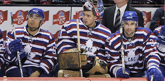
Overview: Classic and vintage logos are timeless and often evoke a sense of nostalgia. These logos typically feature simple designs with traditional fonts and colors. They remind us of the early days of hockey and are perfect for teams looking to honor the sport's rich history.
Features:
- Simple, clean lines
- Traditional color palettes (e.g., black, white, red, blue)
- Classic fonts
Examples:
- Montreal Canadiens: One of the oldest and most recognizable logos in hockey, featuring a simple "C" and "H" in red and blue.
- Detroit Red Wings: An iconic logo with a red winged wheel, symbolizing the city's automotive history.

Courtesy of Hockey Feed FB Page
2. Modern and Sleek Logos
Overview: Modern logos are characterized by their sleek, innovative designs. They often feature bold colors and dynamic shapes, making them stand out. These logos are perfect for teams that want to convey a sense of energy and forward-thinking.
Features:
- Bold, vibrant colors
- Dynamic and abstract shapes
- Modern typography
Examples:
- Vegas Golden Knights: A modern logo featuring a knight's helmet with a bold "V" shape.
- Seattle Kraken: Incorporating modern design elements with a sleek, stylized "S" and a hidden tentacle.
 Courtesy of news.sportslogos.net
3. Animal Mascot Logos
Overview: Animal mascot logos are popular in hockey due to their strong visual appeal and ability to convey power and aggression. These logos often feature fierce animals in action poses, making them perfect for teams looking to intimidate their opponents.
Features:
- Animal imagery (e.g., bears, lions, eagles)
- Action poses
- Bold, aggressive colors
Examples:
- Florida Panthers: A dynamic logo featuring a fierce panther in mid-leap.
- Nashville Predators: A saber-toothed tiger with an aggressive, forward-facing design.
 Courtesy of Adobe Stock
4. Abstract and Geometric Logos
Overview: Abstract and geometric logos focus on shapes and patterns rather than specific imagery. These logos can be highly creative and unique, making them perfect for teams that want to stand out with a distinctive, artistic design.
Features:
- Abstract shapes and patterns
- Geometric designs
- Minimalistic or intricate details
Examples:
- Colorado Avalanche: A logo that combines an "A" with a sweeping avalanche.
- Dallas Stars: A modern star design incorporating the letter "D."
 Courtesy of ESPN.com
5. Cultural and Heritage Logos
Overview: Cultural and heritage logos draw inspiration from local or regional history, culture, and symbols. These logos are ideal for teams that want to honor their roots and create a strong connection with their community.
Features:
- Cultural symbols and motifs
- Regional colors and themes
- Historical references
Examples:
- Minnesota Wild: Featuring elements of nature, including trees and a star, to represent the state's wilderness.
- San Jose Sharks: A shark biting through a hockey stick, reflecting the local marine life.
 Courtesy of ESPN.com
6. Cartoon and Fun Logos
Overview: Cartoon and fun logos are lighthearted and often feature playful characters or whimsical designs. These logos are perfect for youth teams or those who want to add a sense of fun and enjoyment to their branding.
Features:
- Playful, cartoonish characters
- Bright, cheerful colors
- Fun and engaging designs
Examples:
- Anaheim Ducks: A cartoon duck mask, reminiscent of the team's Disney origins.
- Hartford Whalers (now Carolina Hurricanes): The former Whalers logo featured a stylized whale tail.
 Courtesy of Geek_spot
7. Minimalist Logos
Overview: Minimalist logos focus on simplicity and elegance. These designs often use minimal lines and colors to create a clean and modern look. They are perfect for teams that prefer a sleek and understated aesthetic.
Features:
- Simple lines and shapes
- Limited color palette
- Clean and elegant design
Examples:
- Toronto Maple Leafs: A simple, stylized leaf with clean lines.
- Chicago Blackhawks (alternate logo): A minimalist design featuring the team's iconic headdress in a simplified form.
 Courtesy of ESPN.com
8. Shield and Emblem Logos
Overview: Shield and emblem logos are popular in hockey due to their strong, authoritative look. These logos often feature shields or crests with intricate details, making them ideal for teams that want to convey strength and tradition.
Features:
- Shield or crest shapes
- Detailed designs
- Symbolic elements
Examples:
- New Jersey Devils: A bold "NJ" emblem with devil horns and a tail.
- Edmonton Oilers: A shield design featuring a drop of oil.
 Courtesy of Adobe Stock
9. Lettermark Logos
Overview: Lettermark logos focus on typography, using the team's initials or letters as the main design element. These logos are often simple yet effective, making them ideal for teams looking for a straightforward and recognizable design.
Features:
- Typography-based design
- Initials or letters
- Clean and simple
Examples:
- New York Rangers: An "NY" lettermark with classic, bold typography.
- Los Angeles Kings: A sleek "LA" design incorporated into a crown shape.
 Courtesy of ESPN.com
10. Combination Logos
Overview: Combination logos incorporate elements from multiple styles to create a unique and versatile design. These logos can include imagery, typography, and abstract elements, making them highly customizable for any team.
Features:
- Mix of imagery and typography
- Versatile design elements
- Unique and customizable
Examples:
- Boston Bruins: A combination of a bear and the letter "B."
- Calgary Flames: A flaming "C" that combines lettermark and mascot elements.
 Courtesy of ESPN.com
Choosing the Right Logo for Your Team
When selecting a logo for your hockey team, consider the following factors:
1. Team Identity:
- What does your team stand for?
- What values and qualities do you want to convey?
2. Audience:
- Who are your primary supporters and fans?
- What kind of logo would resonate with them?
3. Versatility:
- Will the logo look good on various merchandise, such as jerseys, hats, and promotional materials?
4. Timelessness:
- Can the logo stand the test of time, or will it need frequent updates?
Choosing the right logo for your hockey team is a significant decision that requires careful consideration. Whether you prefer a classic design or a modern, sleek look, there are countless options to explore. By understanding the different types of hockey logos and their unique features, you can make an informed choice that reflects your team's identity and resonates with your audience.
If you need help creating the perfect logo, reach out to a member of the Puck Drop Prints team. We're here to assist you, and our logo design services are free with team orders. Contact us today to get started on a logo that will instill pride and unity among your players and fans alike. Happy designing!


